Premier League 2018 - 2019

The addition of sleeve sponsors may have helped swell club's coffers but it does nothing for the aesthetic of their shirts. And what is it about tyre manufacturers that draws them like moths to the flame? The decision by the Tourist Dept of Rwanda to sink £30 million into a sponsorship deal with Arsenal has aroused much comment. How can such a poor country afford to spend this sort of money on a wealthy club like Arsenal, even if the president is a fan?
You are welcome to Contact Me with corrections and additions.
Contributors are credited in brackets. Opinions expressed on this page are those of HFK and not contributors.
Premier League | Championship | League One | League Two

First

Second

Third
Designer: Puma
Sponsor: Fly Emirates + Visit Rwanda
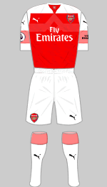
After a very average season, Arsene Wenger pre-empted the real threat that he would be sacked after 22 years in charge by resigning in April. His decision was widely applauded and secures his legacy in Arsenal's glorious history. He is replaced by the Spanulard, Unai Emery.
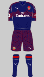
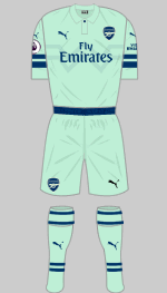
Puma's new bespoke design for the first choice strip features a white yoke and intricate red/white bands on the sleeves and sock turnovers. The alternative is a two-tone affair in "peacoat blue" and dark red which might have been better left on the drawing board. The third strip is "Biscay Green" and looks like a leisure top. Many Gooners are hoping that Adidas will take over as technical sponsor and supply some rather better designs when Puma's contract ends next May.
(Diamond One, MMA)

First

Second

Third
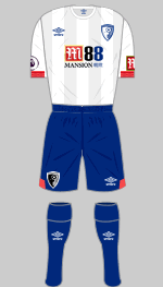
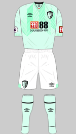
Designer: Umbro
Sponsor: Mansion 88
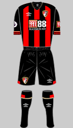
The new change strip features shadow stripes on the shirts as well as bright coral trim to add a dash of colour. Unlike last season's set, this one can be worn at Crystal Palace. The first choice strip is updated with the latest Umbro trimmings, solid black sleeves and the stripes, which continue onto the back, have been reversed. The minty fresh third strip has elaborate stripes with diagonal lines embossed into the front of the shirt.
(Diamond One, Andrew Mihaleff, MMA)

First

Second

Third
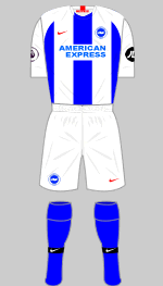
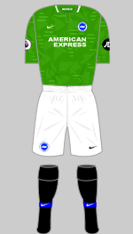
Designer: Nike
Sponsor: American Express + JD Sports
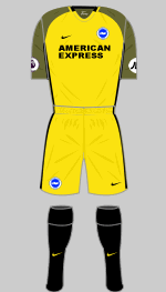
Very broad stripes make for a novel look and it's ten years since the team wore white shorts so you would be excused for not recognising them. The change kit is in the colours of the old Brighton United club that was formed in 1898.
(Juraj Gudába, Phil Swain, Martinos Perdikis)

First

Second

Third
Designer: Puma
Sponsor: LaBa360
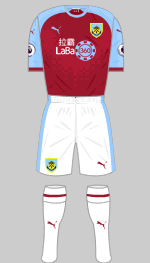
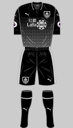
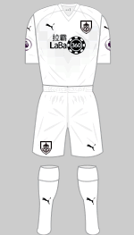
White shorts and socks look so much better (blue versions are available when colours clash) and we're glad to see the last of the silly spotty trim that Puma introduced last season. So much better all round except for the sponsor. There is a faint graphic in the form of a pixelated chevron, a reference to their famous strip from 1975. This also appears on the third strip. The change strip is black with silver trimmings and one of those fading graphics that are so popular this season. This one is in the shape of a honeycomb.
(Benjamin Raynor, Gavin Emerson)

First

Second

Third
Designer: Adidas
Sponsor: Visit Malaysia + JD Sports
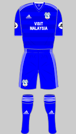
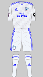
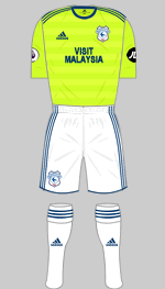
Supporters' delight in their team's promotion was given an extra lift due to Swansea City being relegated. There are no surprises in the kit department, just standard Adidas templates in blue and pale grey. The third kit is retained from last season and was worn with navy shorts and socks at Brighton.
(Alex Morris, Gabriel R, Martinos Perdikis, David King)

First

Second

Third
Designer: Nike
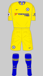
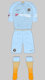
Sponsor: Yokohama Tyres + Hyundai
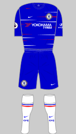
While the new first strip remains faithful to the classic blue/blue/white tradition, the red and white streaks on the shirt have divided opinion. Red detailing goes back to 1960 and was a regular feature in the Eighties and Nineties. Yellow trimmed in royal blue is always a popular choice for the change kit. Like Spurs and Manchester City, the third shirt features an aerial view of the club's home area. It also features reflective applications designed to stand out like cat's eyes under floodlights, which is jolly.
(David Niblock, Diamond One, Nik Yeomans, Juraj Gudába, Detenator Ninety)

First

Second

Third
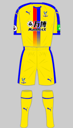
Designer: Puma
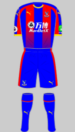
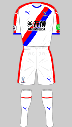
Sponsor: ManBetX + Dongqiudi
Puma have taken over as Palace's technical sponsor and delivered a couple of bespoke strips that proves that you don't have to take stuff straight from the catalogue. The first shirt features "fading stripes" while the alternative is an old favourite that always goes down well with the supporters. Yellow is also considered a lucky colour so it has been chosen for their third strip, which also picks up the fading stripes theme.
(Matt Moor, Ben Gershaw)

First

Second

Third
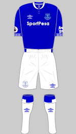
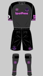
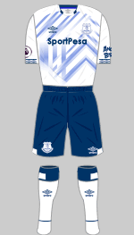
Designer: Umbro
Sponsor: Sport Pesa + Angry Birds
Umbro's double diamond trim reappears this season in a more assertive form as trim at the cuff. Surely it's just a matter of time before we see it running down the shoulders and sleeves once again. The first shirt has subtle marl texture woven into the fabric, a feature that is proving popular. Black and dark grey with bright pink applications is used for the change strip. The abstract design on the third shirt is supposed to be inspired by Prince Rupert's Tower, the landmark that appears on the club crest. It's obvious once it's pointed out.
(Diamond One, David King)

First

Second

Third

Fourth
Designer: Adidas
Sponsor: Dafabet + ICM.com
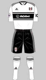
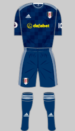
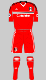
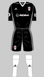
Fulham have returned to the Premier League after victory over Aston Villa in the play-offs last May. In a season when retro kits are all the rage, Fulham have persuaded Adidas to reproduce the first outfit they made for the club exactly 20 years ago. The red strip appeared for the first time in 2016-17 and has been recycled once more for the game at Spurs. For some reason this set was not used for the visit to Brighton and instead, last season's black Tiro top was worn with the first choice shorts and socks.
(Robert, Zachary Lewis, Andrew McEwan, Pablo Aceituno)

First

Second

Third
Designer: Umbro
Sponsor: OPE Sports + Leisu Sports
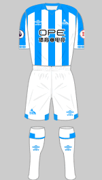
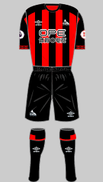
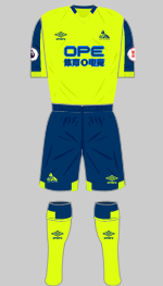
The Terriers hung on to their Premier League place, finishing in 16th place. To celebrate they have introduced a new badge featuring a Yorkshire Terrier (first seen in 1969). The Umbro designed first strip has gone down well with supporters while the red and black alternative reproduces an all-time favourite and is bound to be a sell-out. The less said about the third kit the better.
(Roger Pashby, Detonator90, David King)

First

Second

Third
Designer: Adidas
Sponsor: King Power + Bia Saigon
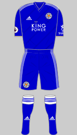
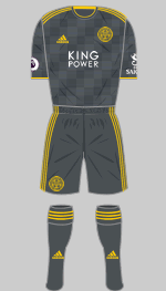
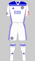
City have changed from Puma to Adidas and are sticking with the all-blue look that they've worn in recent years. White trim will please a large section of the support while there is just a trace of gold at the collar and cuffs of the blue strip. The ubiquitous Condivo design provides the second choice and The white third strip is the Regista design.
(Diamond One, Martinos Perdikis)

First

Special
v Man City 7 Oct

Second

Third
Designer: New Balance
Sponsor: Standard Chartered + Western Union
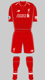
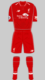
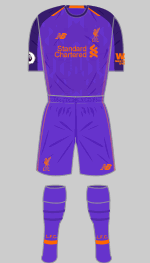
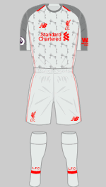
"Shankly Red" is retained and the latest first strip reflects the current trend for subtle detailing to enhance simple design. In this case there is textured fabric for the shirt and white trim at collar and shoulder, New Balance's signature detailing this season. The alternative, in the same template, is in "deep violet" with dark purple trim and orange applications. I don't think Shankly would have been too impressed with that. The third strip is inspired by the 1989 outfit.
(Benjamin Raynor, Diamond One, Andrew Mihaleff, MMA, David King)

First

Second

Third
Designer: Nike
Sponsor: Etihad Airways + Nexen Tire
City broke many records in winning the Premier League last season, an achievement that rested not only on their ability to outspend their rivals but also on Pep Guardiola's knack of turning good players into outstanding ones.
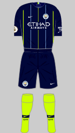
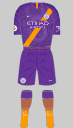
Their new first choice strip may be a standard Nike template but the combination of sky blue, white and navy is a classic that goes back to the club's roots. I still don't like the scratchy thing on the sleeves and shoulders though. There is nothing traditional about the change strip in "blue obsidian", lime green and sky blue nor the purple and orange third choice, which features an aerial view of the Etihad Stadium printed into the shirt front.
(Francesco Pernigoni, Detenator Ninety)

First

Second

Third
Designer: Adidas
Sponsor: Chevrolet + Kohler
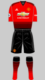
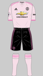
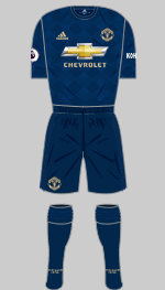
All-blue strips have a special place in United's kit history, harking back to their glorious European Cup win in 1968. This latest third kit is an attempt to draw on that legacy albeit in a very dark shade with subtle textures. It was created as part of Adidas' partnership with Parley for the Oceans and made from upcycled plastics salvaged from the sea. The "home" strip, which is somehow supposed to evoke United's origins as a team of railwaymen, breaks with long-standing tradition by replacing white shorts with black and can only be described as truly awful. The change striop, which was launched at the end of August, is inspired by the Football Pink, the venerable Saturday evening newspaper that closed down in 2007. We favoured The Pink 'Un in our house.
(Diamond One, Cruz Dunn)

First

Second

Third
Designer: Puma
Sponsor: Fun88
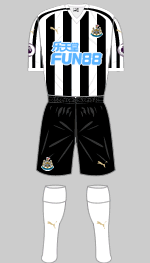
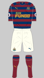
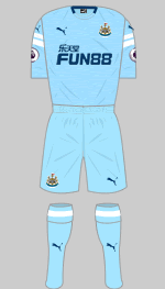
Combining Newcastle's traditional stripes with Puma's Dominate template just doesn't work. The change kit, on the other hand, recreates the maroon and navy hooped favourite from 1995-96 and is simply stunning. Third choice is in "Blue Curaçao" with a fine texture in the fabric of the shirt.
(Philip Marriott)

First

Special
v Leicester 25 August

Second

Third
Designer: Under Armour
Sponsor: Virgin Media
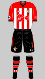
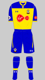
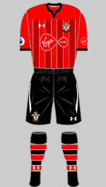
The Saints have returned to rather more conventional stripes this season but they are somewhat minimal, given the solid red sleeves, yoke and the shirts are all-red on the reverse. Yellow and blue hold a special place in Southampton's kit history and will be a popular choice for the alternative. The third shirt is a clever concept although I'm not sure why they need it. It can be teamed with the first choice shorts and socks or the alternative versions shown here.
(Liam Bushrod, Detenator Ninety)

First

Europe

Second

Third
Designer: Nike
Sponsor: AIA
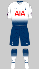
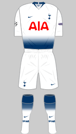
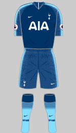
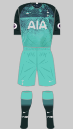
The idea with the new "home" strip is to create a seamless blending effect rather than the traditional sharp contrasts between different elements. Fair enough but it breaks down on the European kit which looks awful. The change kit is a compex affair in three shades of blue, textured effects on the shorts and sleeves and the odd, scratchy trim that Nike unveiled for the World Cup. The graphic on the teal and dark green third shirt is a map of North London. These are not for the purists but they do have a certain style.
(Tony Sealey)

First

Second
Designer: Adidas
Sponsor: FXPro + MoPlay
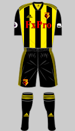
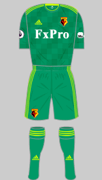
The introduction of striped shirts is a startling break with tradition that has certainly caught us all out at HFK Towers. Red is retained in the sponsor's logo as well as in the printing on the back of the shirt (which is all-yellow). If the Hornets have a good season this may become a classic but if they struggle I expect it will not be fondly remembered. Another mould has been broken with the change kit: as far as i can tell, this is the first time Watford have worn green.
(Zachary Lewis, Detenator Ninety, MMA, Martinos Perdikis)

First

Second

Third
Designer: Umbro
Sponsor: Betway + Basset & Gold
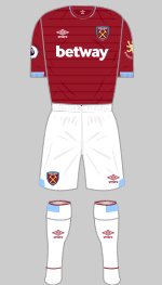
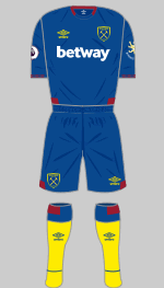
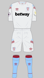
OK, I understand that every so often the Hammers feel the need to wear all-claret tops but I really, really don't like it. The classic look was established long before Bobby Moore, Geoff Hurst and Martin Peters made it iconic and it deserves to be preserved. As for the alternative, I do like the dark teal and claret combination although our Hammers' correspondence hates it. But yellow socks? Really?
(Diamond One, Bobby Guy, Juraj Gudába, Martinos Perdikis)

First

Second
Designer: Adidas
Sponsor: W88 + Coin Deal
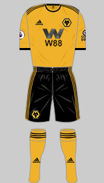
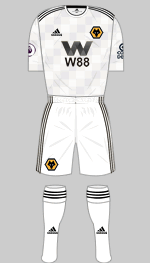
A club with Wolves' pedigree really belongs in the Premier League so it is great to see them back as winners of the Championship. They have switched to Adidas but have had to settle for standard designs rather than a bespoke outfit. The club states that the colour of the first shirt is a return to traditional old gold although some supporters think it's not orangey enough. The problem is that there is no consensus on what Wolves traditional old gold colour actually is as it evolved several times over the years. Another downside is that yet another online bookie besmirches their shirts.
(Geoff Bell, Nik Yeomans, MMA)

